The story so far
You know how to put your own HTML inside a Bootstrap template, to improve its look. There's more, though.
Bootstrap comes with a bunch of components, read to copy and paste. Let's look at a few.
Alerts
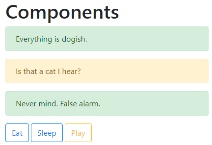
An alert draws attention to something. Could be an error, could be anything you want. For example:

The HTML for that is:
<div class="alert alert-success" role="alert">
  Dogs are the best!
</div>
Another example:

<div class="alert alert-danger" role="alert">
    Warning! Cat detected!
</div>
The Bootstrap alert page has a complete list.
Buttons
This button…

…was made by this HTML:
<button type="button" class="btn btn-primary">Edit</button>This button…

…was made by this HTML:
<a class="btn btn-primary" href="#" role="button">Edit</a>So you can make a button with the <button> tag, or you can make an <a> tag look like a button. We'll use both, when we make apps.
There are other button types, like red buttons for dangerous things such as deleting data. See the Bootstrap buttons documentation.
Navbars
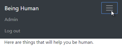
Here's a navbar, or navigation bar, at the top of a page:

A navbar has a branding area, with the name of the site, and maybe a logo. Then it has a menu. The menu in this example is pushed to the right, but menus can on the left, as well. Menus can have dropdowns.
Bootstrap navbars automatically adjust to screen size.

Navbars are more complex than other components. We'll look at details later.
More
There are about a dozen other components you can use. We might use more as we go.
Exercise

To get started, download the zip file with our final template. Put your code in the index.html file.
Make a directory in your littlebootstrap subdomain for this exercise. Upload your file to the directory. Submit the URL.
(If you were logged in as a student, you could submit an exercise solution, and get some feedback.)
Summary
Boostrap has ready-made components you can copy and paste.
